Mastering the Basics of Visual Analysis
$19.99
BCBA CEUs: 2 CEUs
This tutorial offers a systematic, evidence-based procedure for training individuals to conduct valid and reliable visual analyses of single-subject data. It features extensive discrimination training and practice opportunities; adaptive instruction and remediation for errors; and full audio narration in a self-paced, mobile-friendly format.
Brand: CEUniverse
Description
Visual analysis of data is a cornerstone of single-subject research. Yet some researchers have found that experts often disagree about what constitutes an intervention effect. This potential lack of consistency across visual analysts can have negative implications for both research and practice. This tutorial offers a systematic, evidence-based procedure for training individuals to conduct valid and reliable visual analyses of single-subject data. It features extensive discrimination training and practice opportunities; adaptive instruction and remediation for errors; and full audio narration in a self-paced, mobile-friendly format.
About the Authors
Katie Wolfe, Ph.D., BCBA-D
 Dr. Katie Wolfe is an Associate Professor of Special Education and Applied Behavior Analysis in the Department of Educational Studies. Before pursuing her Ph.D. at Utah State University, she worked in various capacities and settings with children with autism and their families, including as a special educator and as a behavior analyst. Her research interests include the development and implementation of interventions to promote language and communication skills in young children with autism, variables that influence the visual analysis of single-case research data, and supporting practitioners in making data-based decisions. She is also interested in parent and practitioner training. Katie Wolfe teaches courses in applied behavior analysis and single-case research design.
Timothy Slocum, Ph.D.
 Dr. Timothy A. Slocum is a Professor and Department Head of the Department of Special Education & Rehabilitation at Utah State University. He earned his doctorate in Special Education at the University of Washington in 1991. Dr. Slocum received the 2011 Fred S. Keller Behavioral Education award from Division 25 of the American Psychological Association and the 2014 Ernie Wing Award for Excellence in Evidence-Based Education from the Wing Institute.
Learning Objectives
Upon completing the tutorial, the learner should be able to:
- Describe the basic purposes of single-subject research
- Identify the key parts of line graphs that depict behavioral data
- Define level and estimate the level of a data path
- Define slope and estimate the slope of a data path
- Project the slope of baseline data into the intervention phase to compare the projected data pattern to the actual data pattern
- Identify whether an intervention may have caused a change in the level or slope of behavior
History
This tutorial was initially developed as part of the first author’s dissertation research at Utah State University. A commercial version was released by FoxyLearning in August 2015. It is updated on an ongoing basis, with significant updates occurring in January 2020, August 2022, and May 2023.
Content
You can access a sample lesson for free below. Please note that your progress on sample lessons is not tracked or recorded.
Module Content
126 reviews for Mastering the Basics of Visual Analysis
| 5 star | 54 | 54% |
| 4 star | 26 | 26% |
| 3 star | 13 | 13% |
| 2 star | 3 | 3% |
| 1 star | 0 | 0% |
Sorry, no reviews match your current selections
You may also like…
-
Article Quiz

1 BCBA CEU
Reducing Biases in Clinical Judgment with Single-Subject Treatment Design
Daniel J. Moran & Wendi Tai4.08 out of 5(13)$9.99 Add to Cart Quick View -
BundleSale!

7 Total BCBA CEUs
4 Ethics CEUs3 Supervision CEUsPlanetary Bundle
$69.94Original price was: $69.94.$48.94Current price is: $48.94. Add to Cart Quick View -
Article Quiz

1.5 Total BCBA CEUs
1.5 Ethics CEUsEstablishing Consumer Protections for Research in Human Service Agencies
Linda A. LeBlanc, Melissa R. Nosik, & Anna Petursdottir4.60 out of 5(15)$14.99 Add to Cart Quick View
Related products
-
Interactive Video

1.5 BCBA CEUs
Chomsky vs. Skinner: In Their Own Words
Noam Chomsky & B.F. Skinner4.77 out of 5(22)$14.99 Add to Cart Quick View -
Interactive Video

1.5 BCBA CEUs
B.F. Skinner on Education
B.F. Skinner4.94 out of 5(32)$14.99 Add to Cart Quick View -
Article Quiz

1 BCBA CEU
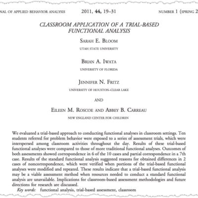
Classroom Application of a Trial-Based Functional Analysis
Sarah E. Bloom, Brian A. Iwata, Jennifer N. Fritz, Eileen M. Roscoe, & Abbey B. Carreau4.69 out of 5(29)$9.99 Add to Cart Quick View


Good review and opportunities to practice the skills.
This course was a great review of visual analysis. It also provided a few handy tricks and tips!
SUPER helpful. TY!
Awesome!
The practice sections were helpful and kept me engaged. Great training!